


by TED MININNI, president and creative director, Design Force
How does a brand stand out among the visual chaos and oversaturation of the toy categories at retail? There’s a broad spectrum of design strategies that companies need to employ correctly to make a brand’s packaging successful, such as establishing solid package design architecture, owning a color palette, and staying consistent. If I had to narrow it down to three key factors that are absolutely critical to get right in toy packaging, these are my top tips.
1. Incorporate Distinctive Package Design Architecture
We define package design architecture as a uniquely dominant design element that works in conjunction with the brand’s logo to draw consumers’ attention. It’s what shoppers look for — whether consciously or subconsciously — when they’re trying to find their favorite brands at retail. It may take the form of a highly identifiable graphic shape that consumers immediately associate with the brand or it may be other elements, such as illustrated or photographic imagery, a consistently configured piece of character artwork, or an iconic pattern or texture. As is the case with the brand’s identity, it must always be consistently placed within the package design system for it to be effective.
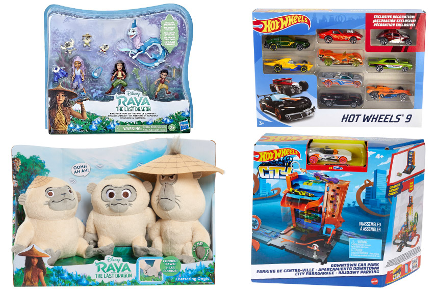
Think: the lush vegetation with Kumandra flowers that dominates the package design for Disney’s Raya and the Last Dragon products or the action-packed cityscape silhouette that appears in blue tones on Hot Wheels packaging.
2. Own a Color Palette
For toy packaging, color plays a critical role in establishing an immediate visual connection between brands and consumers. Think of the global brand leaders in the toy industry — those that own their respective categories — and a color will instantly come to mind.
Although it’s tempting for some brands, especially new brands with no visual equity, to simply take a look at the competitive offering in their category and select a color for their brand that’s not already in use, this isn’t an effective approach to owning a color. The visual impression of any given category tends to change quite frequently as both dominant and emerging brands update their packaging. Therefore, there is no guarantee that another brand won’t use the color they’ve selected by the time their products ship.
With this in mind, it’s best to look inward at the brand itself when taking ownership of a color or a color palette and establish one that is meaningful and innately associated with the brand’s distinctive attributes and personality.
3. Be Consistent with Marketing Communication
The downfall of most toy packaging is the tendency to place marketing communication wherever space is available on the package. This can be detrimental to a product line’s shopability because consumers will struggle to find the information they need to make their purchase decision if the packaging is too busy.
When done correctly, brands will consistently place and treat the toy’s benefits, features, and any other pertinent information in the same visual manner across the entire product line — ideally in one dedicated space that will serve as an easy-to-locate “information center.” Taking this approach creates a more intuitive shopping experience for consumers, increasing the likelihood that they’ll make a purchase.
It’s also important to be clear and concise with on-pack marketing communication, focusing only on what’s most compelling and differentiating about the brand and the product. Consumers often ignore verbal communication that is too lengthy or complex. Effectively deliver the information in a concise way.
Pulling it all together
Whether you have an existing toy brand or you’re introducing a new one, these three design strategies will put you on the right path to ensuring that your packaging has the best opportunity for success at retail.
Start by evaluating your brand and mining for inherent assets, attributes, and visual cues that distinguish it from all other brands in the marketplace. Then, infuse them into ownable package design architecture, leverage them to establish a unique color palette, and convey them to consumers through consistently treated on-pack marketing communication.
This article was originally published in the May 2022 edition of the Toy Book. Click here to read the full issue!