
By Phil Albritton, Power Kid Design & Development
Through the years, I have been blessed to develop hundreds of outdoor toy products and packages. From the Original Funnoodle to bounce houses, waterslides, and sprinklers, the goal is that each product offers a new way to have safe fun outside. Outdoor products also offer several unique challenges, not the least of which is the packaging art. More than half of toy purchase decisions are made while in the store, and this is especially true with seasonal outdoor products that are often purchased with a particular event in mind and often well after the summer has begun. With this in mind, below are some criteria and guidelines you can use to make the summer a blast for your customers, and make sure that they fill their carts with your outdoor products.
Tell a Story About Happy Kids
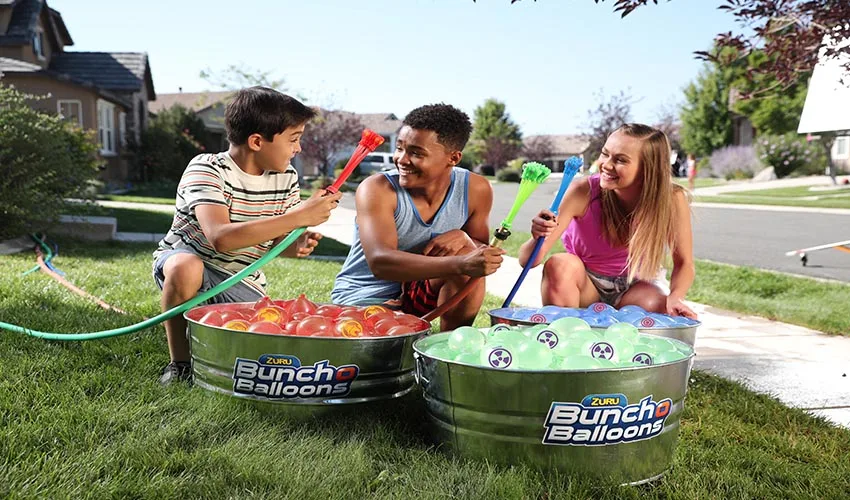
Let’s be clear, parents ultimately do not want waterslides, bounce houses, sand and water tables, sprinklers, trampolines, or water blasters. They seek something more emotional and satisfying; they want happy and engaged kids. Give them this on the package and your product has a much better chance of making it to the check out.
I always lean toward great photography rather than illustration on outdoor toy products. This can change if the product is positioned in an open box, but good photography is a powerful tool. In an instant, both mom or dad and child can relate to the scene of kids—slightly older than your target market—having fun around a particular product. Outdoor toys are often played with in groups, so you have a great opportunity to show multiple kids playing and interacting with each other.
Put the product in its natural environment—use a yard of grass as a background rather than against a blank or graphic backdrop. If you are using studio photography, make sure the set is brightly lit to mimic an outdoor setting. Many times you will be compiling the final hero shot from multiple photo sources and rendering it in an outdoor setting. Finally, if the product is intended for outdoor safe battling, try not to have your models appear aggressive or angry, which we see more than you might imagine!
Put Up a Big, Bright Billboard
When working with outdoor product, you typically will have large surfaces or box panels to cover with artwork. Even your blister packages will be large in comparison to other toy categories. Use your great photography to fill the majority of the print surface. Now, ask yourself what are the core propositions about this product that are not clearly communicated in the photography?—What does it do? Why is it fun? What unique features does it have?
Use short bold callouts—“Inflates in one minute!,” “Floats up to 50lbs!,” “Blasts more than 80ft!,”—to emphasize what your customer cannot immediately see in the main hero image.
What about risk?
Many outdoor products look like fun, but parents are concerned about its safety. Put yourself in the end users’ place, and if a product might be perceived as unsafe, address the issue. Mention any safety features that have been engineered into the product and callout maximum user weights. Add an adult to the package photography if adult supervision is required, water is involved, or there is any perceived risk that might be an issue if kids are left alone with the product. Make sure your customer knows it’s, “Safe, soft fun!“
Paint a Picture
Color palette choices for outdoor products are critical. Keep the palette bold and bright. Often, a green grass field will take up much of the front panel real estate, so make sure your palette works well in that context. Consider bright Pantones or foil stamping to increase perceived value and attract more eyes your way.
Beware of anything too monochromatic, and make sure to balance between three to four palette colors. If your product is in an open box, ensure the product colors contrast with the packaging background. Your product is the hero of the story and you want it to stand out. Keep your palette in mind too as you complete photography. Any clothing that blends into the background should have its color changed to contrast.
Remember, your packaging is your storyteller, sales person, and beacon. Make it the best it can be.
Power Kid Design & Development is a Nashville-based toy development studio. Phil Albritton can be reached at 615-545-2015 or design@philalbritton.com.
