

by TED MININNI, president and creative director, Design Force
The bells are jingling and stores are filled with holiday-themed products once again. As spending increases during the holiday season, it’s no wonder many manufacturers try to capture their share of sales with holiday-specific campaigns.
For us toy industry folks, this is our time to shine. Our products are on everyone’s shopping lists, and, hopefully, they’ll find their way into everyone’s shopping carts as well. This is the time of year we get to see if our packaging is doing what it’s meant to do: capturing the attention of consumers to inspire a purchase. For most toys, packaging doesn’t change to accommodate the holidays, but what about brands with seasonal items? How should these brands establish a holiday-themed packaging look without diluting their core brand messaging? Let’s take a look at how brands can develop seasonal packaging without deviating completely from their established and equitable look.
LESS IS MORE WHEN MAKING CHANGES TO AN ESTABLISHED LOOK
When developing a holiday-themed look, the most ideal scenario would be to not have to completely rethink a brand’s package design to appeal to consumers during the various holiday seasons throughout the year. Why? Because any change made to a brand’s package design can potentially compromise the connection that the brand has already established with its consumers at retail. There are a variety of visual assets within a brand’s package design system that resonate with consumers on a subconscious level — the brand identity design and placement, the design architecture, the brand color palette, the treatment and placement of benefits and features communication, the product imagery, and the overarching visual aesthetic — all of which take time to establish an association with the brand in consumers’ minds. Therefore, modifications to any of these assets as a brand develops its holiday-themed packaging should be made with careful consideration.
With this in mind, brands should consider changing only one or two aspects of their everyday look. Maybe add a holiday-themed pattern to the overall background color. For Christmas-themed packaging, perhaps strategically integrate a ribbon and a bow into the current design. For Valentine’s Day, maybe a red-and-pink snipe in one corner or a heart-shaped call-out will do the trick.
DESIGN EVERYDAY PACKAGING WITH HOLIDAYS IN MIND
To achieve a perfectly seamless transition to a holiday-inspired design, a brand’s everyday package design should be developed with its holiday versions in mind. This is especially true for brands that create dedicated packaging for four major holidays: Valentine’s Day, Easter, Halloween, and Christmas. Brand owners need to establish which areas of their package design will change to holiday colors or be replaced by holiday-specific assets, while also determining which aspects of the package design system will remain consistent to ensure brand recognition and to continue to build visual equity throughout the year.
REFRESHING THE GLOBAL PACKAGING PROGRAM FOR AN ICONIC BRAND
When Peanuts Worldwide decided to refresh the global packaging program for its core Peanuts licensed products, the company wanted to establish a new look that would accommodate everyday products as well as seasonal, holiday-themed products. The objectives for the design refresh were to create a simple, contemporary visual aesthetic that would work consistently across any conceivable packaging format, while paying homage to the origins of the beloved Peanuts brand — the comic strips by Charles M. Schulz.
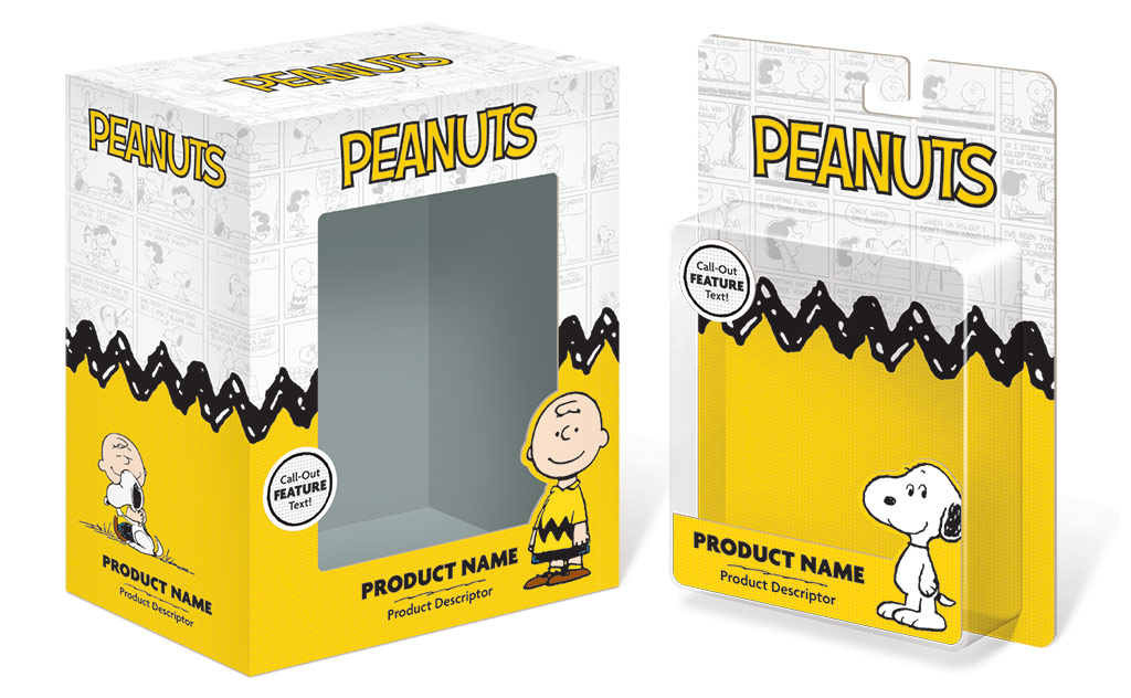
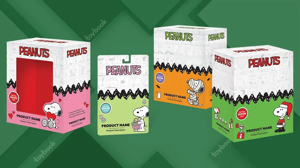
Although our primary focus during design development was to create the look for everyday Peanuts licensed products’ packaging, we never lost sight of the need for that very same look to transition to the packaging for holiday licensed products. Our design solution leverages iconic elements associated with the Peanuts brand. There may be nothing more iconic in the world of Peanuts to represent the brand than the device we employed as the primary package design architecture — the zig-zag graphic from Charlie Brown’s sweater — which bisects the design. Above the zig-zag graphic is a repeat pattern made from a collection of Schulz’s Peanuts comic strips from both the vintage and classic eras, appearing in a gray-on-white tone to serve as the backdrop for the Peanuts logo. Below the zig-zag is a distressed halftone pattern — a nod to the comic strip printing process — in shades of yellow. Snoopy serves as the primary character representing the Peanuts brand. However, the full cast of Peanuts characters is made available for licensees to utilize on packaging for character-specific products. Side panels depict scenes that portray the familiar relationships between the characters, and also leave room for product imagery as well as product benefits and features communication.
TRANSITIONING FROM EVERYDAY TO HOLIDAY-THEMED LOOKS
Every aspect of the look established for everyday core Peanuts licensed product packaging plays a role in the seamless transition to holiday-themed variations. The placement and relationships between the key components of the overarching design remain exactly the same. However, the color of the Peanuts logo, the halftone pattern, the call-out violator, and the window box insert shift to red and pink for Valentine’s Day, a pastel palette for Easter, bold orange with green and purple accents for Halloween, and classic red and green for Christmas. The extensive Peanuts art asset archives allowed us to swap everyday character artwork for dedicated, holiday-specific character artwork and props. And, since Schulz created countless comic strips for each holiday, we were able to create a unique, holiday-themed comic strip pattern for the upper portion of each holiday’s package variation.
When viewed alongside the everyday core Peanuts licensed product packaging, the visual continuity in the holiday-themed variations is glaringly obvious, and so are the benefits to this approach to package design. Everyday and holiday-themed products can coexist at retail without compromising the brand statement. Furthermore, the overarching new look for the global packaging program for core Peanuts licensed products can continue to build recognition among brand enthusiasts throughout the year.
This article was originally published in the 2022 Innovation & STEM issue of The Toy Book. Click here to read the full issue! Want to receive The Toy Book in print? Click here for subscription options!