by TED MININNI, President and Creative Director, Design Force
As a toy industry veteran with 38 years under my belt, I’ve witnessed a myriad of shifts in toy packaging design strategy, whether influenced by the advent of brand licensing, the quest for sustainability, or the need to appeal to ever-changing consumer tastes and buying habits.
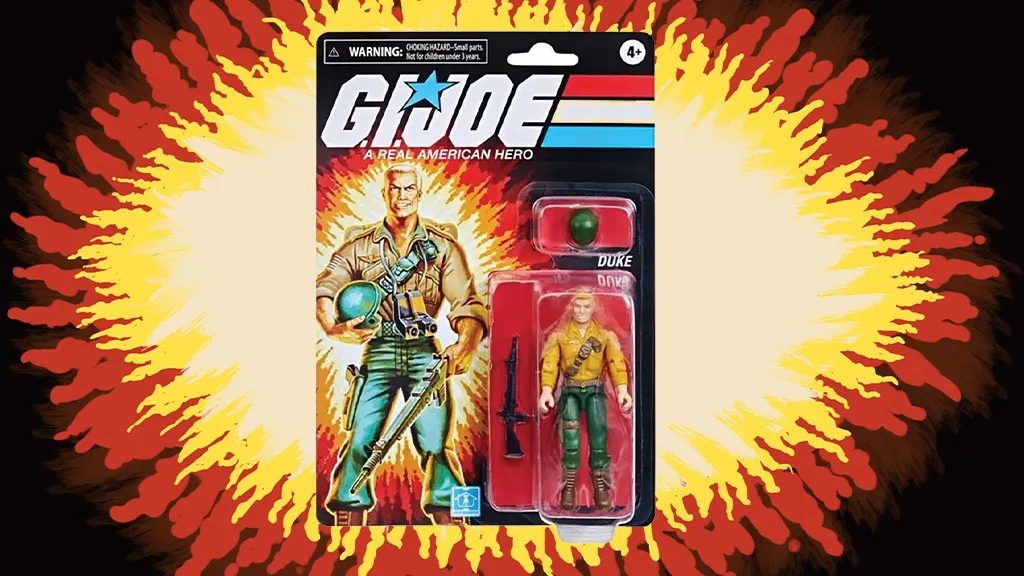
When I first started as a package designer, many of the best-selling products were inventor items, with no support from an animated TV series or blockbuster film. The approach to package design at the time typically involved creating a highly-rendered logo and an illustration of the product based more in fantasy than reality, often over-promising on the play pattern. Think of the battle scenes on the front of any G.I. Joe action figure or playset package from the ‘80s. Quite a bit of exaggerated firepower going on there!
SHIFT TO BRAND LICENSING
Thanks to the success of Star Wars and the franchise’s licensed action figures and playsets from Kenner, the approach to toy marketing was redefined and brand licensing took over the industry. Visually consistent branding became more important because consumers — including adult collectors — were shopping for their favorite brands rather than for specific products. Therefore, package design needed to instantly relate the product line to a particular series or film franchise.

DEMAND FOR TRANSPARENCY
Toy manufacturers today face the challenge of appealing to more savvy and discerning consumers. As a result, we’ve seen fantasy-based illustration evolve into more photorealistic illustrations or moderately enhanced photography that more accurately represents the product. We’ve seen closed boxes replaced with window box structures so the product is visible at retail. And, we’ve seen marketing become more realistic and truthful.
EVOLVING PACKAGE STRUCTURE
Arguably the most dramatic change in package design is in the industry’s approach to package structure, improving the shopping experience and reducing waste. In the early to mid-‘80s, package structures were simpler and conformed to a few standard configurations. Today, package structure design is more dynamic, employing a variety of shapes, configurations, and substrates to tell the brand story uniquely, complete with “try me” features and dimensional call-outs to better engage consumers.
Forty years ago, blister cards were quite large, providing ample visual space for branding and illustration. To be more sustainable, their size has been reduced dramatically, requiring designers to find new and clever ways to appeal to consumers within much smaller dimensions.
Although window box structures haven’t evolved much, many acetate windows have been eliminated in favor of open or tray box structures. In some categories, there hasn’t been much change at all. For example, the tray-style structure of the original Super Soaker packaging that I designed at Larami Corp. is still the basis for most water blaster packaging today.
A BRAND EXPERIENCE
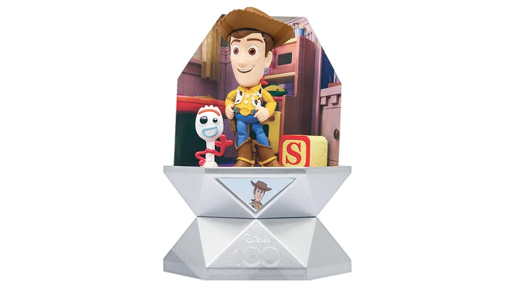
The popularity of YouTube unboxing videos in the mid-2000s was a catalyst for the advent of blind box packaging, originally hitting toy aisles with brands like Shopkins and L.O.L. Surprise!, which leveraged the anticipation and suspense of opening the package to drive sales. This trend has evolved from simply hiding the contents of the package to creating an elaborately layered unboxing experience, such as the one YuMe’s Disney 100 Surprise Capsules provide.
NEW ERA, SAME GOALS
Although we’ve witnessed quite an evolution in toy package design strategy since the early 1980s, its goals remain the same: generate excitement about the play pattern without over-promising; let consumers know at a glance what they’re purchasing and how it works; minimize the use of materials to eliminate waste; protect the product from damage; and most importantly, provide consumers with an enjoyable brand experience at retail.
A version of this article was originally published in the February 2024 edition of The BIG Toy Book. Click here to read the full issue! Want to receive The Toy Book in print? Click here for subscription options!


