
by Ted Mininni, President & Creative Director, Design Force Inc.
This fall, the core line of Mighty Morphin Power Rangers: Re-Ignition products will hit retail shelves, marking the initial collaboration between Power Rangers brand owner Hasbro and Playmates Toys. The revamped line includes a broad range of innovative products from action figures to role-play items inspired by everyone’s favorite teens turned alien-fighting heroes and their action-packed adventures from the original series, which aired in 1993.
Shortly after this exciting licensing agreement between the two global toy manufacturers was established, Playmates Toys engaged our design team to develop the packaging for the core product line.
“Our design objective was to create a fresh, new package design system that generates excitement among today’s kids, who are discovering Power Rangers for the first time, and pay homage to the original series in a visually authentic manner to appeal to parents and collectors who have an affinity and love for the brand because they grew up watching it,” explains Michele Adamsen, Vice President, Creative Services at Playmates Toys.
MINING FOR VISUAL CUES
Before embarking on the design development process, we immersed ourselves in the history of the Power Rangers franchise, sifting through every incarnation of package design presented to fans over the previous 31 years to uncover equitable, evergreen visual cues associated with the brand. We then evaluated the packaging for the original series to determine which assets would be perceived by adult fans as unique to the brand’s first three years.
We concluded that five iconic elements should be incorporated into the new Mighty Morphin Power Rangers: Re-Ignition package design system: a palette of various tones of bright green to serve as an ownable overall background color; the five individual Power Rangers colors leveraged in a meaningful way to refer to the original series in a single brand voice; the white diamonds that appear on the Power Rangers uniforms used as an iconic accent; authentic lightning bolts strategically integrated as an energetic, unifying thread; and bold, colorful imagery of the five different Power Rangers helmets playing a primary role as distinctive package design architecture.
RE-IMAGINED AND REFINED
We began design development with a refresh of the original Power Rangers logo. The objective was to update it completely, yet maintain the original equitable attributes to be immediately recognizable and familiar to fans who grew up with the brand. None of the original attributes were eliminated, yet all were re-imagined and refined.
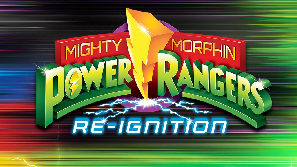
The refreshed logo maintains the original Power Rangers custom typography – still extruded, underlined, on a sweeping arc, and in tones of green — yet it’s more visually balanced and rendered in a cleaner, more contemporary manner. Behind it, the arced red “wall” that holds the Mighty Morphin segment typography has been redrafted and perfected. The bold, yellow, three-dimensional lightning bolt — the iconic centerpiece of the original logo — is much cleaner and brighter. And the purple disc, now a perfect circle, continues to tie everything together in the background. Lastly, we added lightning at the base of the yellow, iconic bolt to integrate the blue and white Re-Ignition typography into the refreshed logo design, marking the start of a new era.
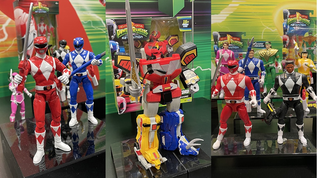
Once the logo design was completed, our team began generating concepts for the core product line’s package design system, working with the blister card and window box structures as a basis for design development.
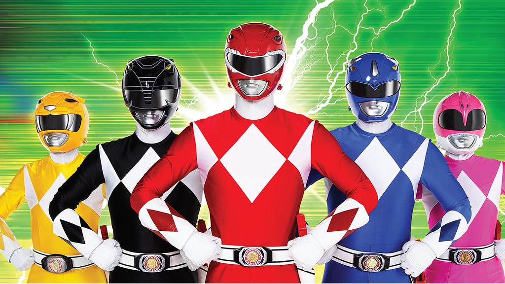
Pictured above: The packaging for Mighty Morphin Power Rangers: Re-Ignition has been designed to generate excitement among today’s kids and adult fans who grew up with an affinity for the brand. | © 2025 SCG POWER RANGERS LLC AND HASBRO
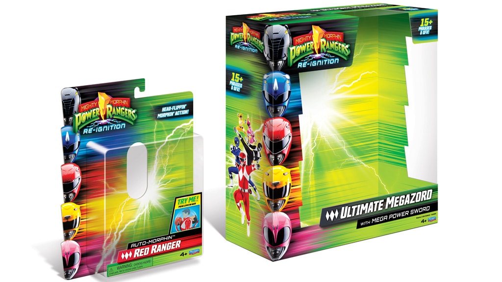
Our package design system solution features a vertically stacked “totem” of the five Power Rangers helmets leveraged as a bold, dynamic package design architecture anchored to the front panel’s left side to initiate the storytelling. The helmet images were sourced from original photography, then digitally enhanced to make each color more vibrant and impactful, ensuring that they will be hard to miss by fans of all ages at retail. Emanating from behind the helmets are bold, horizontal streaks of energetic color that transition to a bright green, horizontally streaked background texture. A bright, white burst of energy and lightning serves as the product field, either as an overlay on the blister card or a bright green streaked background on the window box insert. These modular elements combine to form an exciting, contemporary backdrop for the core product line.
The refreshed logo locks up with the helmet totem in the upper left corner, while the product name and descriptor originate from the lower right corner, often in conjunction with product feature photography and associated text or Try Me! communication. Key call-out communication appears in bold white and yellow on a black, horizontal holding shape, edged in blue to tie in with the treatment of the Re-Ignition typography.
On blister card packaging, a die-cut emphasizes the helmet totem along the left edge. On all boxed packaging formats, the helmet totem transitions to the left side panel, featuring action poses of all five Power Rangers over a burst of lightning. On window box packaging, the blister card die-cut is mimicked along the left and right sides of the window die-cut to continue the lightning bolt theme.

MEANINGFUL SEGMENTATION
Both color and iconography play integral roles in the Power Rangers universe. Leveraging them meaningfully as part of the new Mighty Morphin Power Rangers: Re-Ignition packaging sets up the perfect product segmentation system. Character-specific color in the product name area allows consumers to easily navigate the product line and quickly locate their favorite products.
The basis of the product segmentation system is a horizontal bar that picks up the energetic color streaks for each character and holds the product name. The bar is skewed to the same degree as the typography that it holds, and is extruded, so it has a dimensional quality. To the left of the product name is an icon inspired by the diamond motif on the Power Rangers uniforms in the original series. For products that represent the brand in an all-encompassing way, the color streak within the horizontal bar shifts from the individual Power Rangers colors to a blend of green and black, yet still retains the diamond icon. For alien characters, the color streak within the horizontal bar shifts to purple, and the diamond icon is replaced with an icon depicting Rita Repulsa’s headpiece.
The five Dinozord icons have also been redesigned in a simpler, more relevant, and contemporary style for the new packaging. These icons replace the diamonds within the product segmentation system on all Dinozord product packaging. Yet, the product name bar retains the color streaks associated with each Dinozord’s Power Rangers character.
DESIGN WITH MORPHIN IN MIND
The core Mighty Morphin Power Rangers: Re-Ignition package design system has been developed with maximum flexibility in mind. All of the modular design assets can be configured to accommodate any conceivable structural configuration or reworked to create retailer-exclusive packaging that’s distinctively different while retaining enough visual equity to coexist cohesively with the core line look.
Having an opportunity to work with amazing, evergreen brands like Power Rangers never gets old. We’re proud to have played a role in the most recent iteration of the logo and package design system for one of the longest-running kids’ live-action series in television history, and in the initial collaboration between two of the toy industry’s global brand leaders.
“We had a clear objective: to revamp the packaging and branding in a way that not only captures the attention of new fans with fresh, exciting designs, but also resonates with original fans — many of whom are now parents — so they can re-engage with the franchise and share their love for it with the next generation,” says Pete Kellond, Global Creative Director of Licensed Consumer Products at Hasbro. “Design Force, along with our amazing partners at Playmates Toys, nailed it from the start, and we’re absolutely delighted with the outcome.”
Stay on the Pulse of Play!
A version of this feature first appeared in The Toy Book‘s Licensing & Entertainment (+Baby!) Issue. Click here to read the full issue!
Want The Toy Book delivered straight to your desk? Subscribe here and never miss a beat in the world of toys and play! Get seven big issues in print each year.