

Creating a Visual Language that Appeals to Younger Generations
by Ted Mininni, president and creative director, Design Force
How can we reach new generations of consumers? Many marketers at mature consumer product companies ask themselves this question, as younger customers actively seek brands offering personalities and experiences that are relevant to them.
You may think this is best left in the hands of disruptors—the brash brand startups and fearless entrepreneurs. While there are plenty of examples of these kinds of brands, there are also intriguing new launches from consumer product companies with deep heritages. Brands that market the most common products to millennials and their kids in a relevant manner are even more compelling.
How do they achieve this? By creating brands that “kid speak.” In other words, they infuse brands with personality, quirkiness, and fresh appeal. Developing a unique visual and verbal language heightens the consumer’s experience with the brand based on its persona, which is integrated into every marketing platform. But no marketing vehicle can “kid speak” more persuasively than package design.
Positively Bubly With Success
I liked the package design concept for bubly, PepsiCo’s sparkling water brand aimed at younger consumers, so I anticipated success for its launch last February. Remember, sparkling water is a commodity item and—as is the case in most beverage categories—there are endless choices. So how can you make this brand “kid speak?” Bold, new flavors, for one thing, and a unique delivery. bubly’s brightly colored cans, which feature a cool logo, carbonated bubbles, and smiles, clearly stand out among brands displayed in standard industry packaging. There are toothy smiles, smiles that sport mustaches, or tongues smacking smiling lips. Personality? Check.
When consumers make eye contact with this packaging and step up to check it out, bubly literally greets them. The color-coordinated pull tabs—part of the brand’s variety segmentation strategy—say “hiya,” “hey u,” and other colloquial greetings.
While these custom pull tabs are an added expense for PepsiCo, they contribute to the customer experience with the brand. Consumers then read that all of the flavors are natural, which is very relevant to the younger demographic.
Overall, the brand’s visual and verbal expressions clearly denote fun, but is this aligned with the company’s vision? PepsiCo’s press release on bubly’s launch reads, “PepsiCo today announced the launch of bubly, a new sparkling water that combines refreshing and delicious flavors with an upbeat and playful sense of humor to shake up the sparkling water category while keeping it real with no artificial flavors, no sweeteners, and no calories.” PepsiCo invites customers to #crackasmile, and that’s exactly what we do when we see packaging smiling at us: We smile back.
bubly’s brand, design, and experience came together to help PepsiCo beat its revenue forecasts. That isn’t bad for one of the world’s largest beverage companies, and one that doesn’t fit our contemporary image of a disruptor.
Not Your Mother’s Makeup
When Sephora landed in New York City from France in 1998, the cosmetics retailer found the sweet spot to offer a new makeup buying experience for younger consumers.
Sephora understood that millennials and younger consumers want to go into a store and try all of the products for themselves, reminiscent of the joy they experienced rummaging through their moms’ makeup bags as kids. Modern, upscale Sephora interiors beat drugstore makeup displays any day, and they’re far more accessible than the department store makeup counters staffed with lab-coated makeup technicians.
As you’d expect, Sephora’s stores are cool, but they also demonstrate how architectural branding can evolve to keep pace with young consumers, who are less inclined to hit the shopping malls. Just a year ago, the company opened a new store concept in Boston—Sephora Studio. At 2,000 square feet, this new beauty studio was the smallest Sephora store in the country. It began to offer consumers 45-minute makeovers and 15-minute facials on demand to foster a more intimate experience.
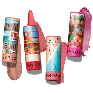
But nothing is more central to the Sephora experience than its branded products. Last year’s launch of Sephora Collection’s #LIPSTORIES featured 40 shades of long-lasting lipsticks with a new, highly pigmented formula in cream, matte, and metallic finishes. It is the packaging for these lipsticks that shakes up everything else within the category. Each shade has a unique package design featuring an image of a place, experience, or object that is reminiscent of that shade of lipstick. It’s cool, it’s art, and it’s made of biodegradable cardboard, too. While high-end in appearance, the product sells for a cool $8. This is branding that hits on all cylinders for kids and young adults. In an interview with beautypackaging.com, Beth Hayes, vice president for Sephora Collection says, “We created Sephora Collection #LIPSTORIES, a new inspirational collection … that encourages our one-of-a-kind clientele to tell their unique story, as inspired by the colorful shade range and unique packaging.”
Is it any wonder that Sephora is connecting with young consumers, or that it’s redefining the cosmetics business?
Toying Around
What are the things that appeal most to kids? Toys that are funny, ugly, and gross. If you don’t believe me, look at the proliferation of hot toys in the marketplace these days, many of which touch on one or all of these attributes. Hasbro’s game, Don’t Step in It, is a great example. So are toys such as Mattel’s Monster High dolls, Skyrocket’s Grumblies, and Cra-Z-Art’s make-your-own Nickelodeon slime kits.
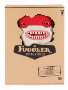
There’s also a proliferation of plush introductions in the marketplace. Some of the hottest brands are funny, ugly, and gross—but also cuddly! It’s a conundrum, sure, but it makes perfect sense to kids. For example, Spin Master recently acquired the rights to UK property Fuggler, a unique line of collectible plush dolls. A company press release from last July about the acquisition reads: “Having originated in the UK, the funny, ugly Fuggler monsters began to gain a cult following due to their quirky and off-beat nature. Each character features a unique toothy smile or grimace, eyes, and a signature butt-onhole. Their imperfectly perfect look and mischievous expressions are irresistible … There are more than 50 unique Fuggler characters to collect, available in 9- or 12-inch sizes. Rare characters can be discovered by checking for glow-in-the dark teeth and eyes.”
Speaking of eyes, there are Fugglers with shiny, glass eyes and Fugglers with kooky, mostly mismatched button eyes. Their mouths and other facial features have a hand-sewn appearance. These plush characters are reminiscent of sock puppets in many ways, but they’re contemporized versions for a new generation of kids ages 4 and up. Actually, I can envision this toy appealing to tweens, teens, and even adults who enjoy quirky pop culture products.
In a wise move, Spin Master chose to package Fugglers in the most basic, brown packaging. Or is it basic? Consumers can see the Fuggler’s unique face peering out at the world through the die-cut window surrounded by monster bite marks. Since the package design is purposely minimalistic, the total focus is on the monster with a toothy, slightly malicious grin. The brand identity, a black cartouche, also features bite marks on its upper left-hand corner. Bite marks also appear on the letter “F” and the letter “R” in the Fuggler logo, which allows the same brown carton color to show through its holding shape. Underneath the logo is a simple three-word descriptor of the toy— “Funny Ugly Monster.”
The only other verbal brand communication on-pack features a “warning,” posted within a box in the lower right-hand corner. It tells kids to “Adopt at your own risk,” and advises them to sleep with their mouths closed and one eye open. This leverages “kid speak” in a highly relevant manner for children. In fact, it makes the brand irresistible.
What Spin Master began on-pack, it fleshed out further on the Fugglers brand website, with storytelling that has the right tone, a bit of irreverence, and a whole lot of audacity that promises to create another pop culture following.
You might observe that Fugglers are toys, and so, of course they “kid speak.” Let’s remember that a great deal of plush in the marketplace is cute and cuddly, so there’s an opportunity to go counter-culture to great effect. The packaging, as well as the product and its positioning, heightens the brand’s appeal to kids.
Whether a brand is born of a heritage company or of a new one, developing unique visual and verbal language properly rooted in “kid speak” will be the determining factor in its success. Nothing matters more than its interpretation on pack, since that is where the brand meets the consumer in person.
[author] [author_image timthumb=’on’]https://toybook.com/wp-content/uploads/2019/02/Ted-Mininni.jpg[/author_image] [author_info]Ted Mininni is president and creative director at Design Force Inc., a package and licensing program design consultancy to the consumer product and entertainment industries. The goal of Design Force is to establish strong emotional connections with consumers and create powerful visual brand experiences that engage, excite, entertain, inspire, and influence consumers’ decision to buy. Mininni can be reached at (856) 810-2277. Visit designforceinc.com for more information.[/author_info] [/author]
This article was originally published in the February 2019 issue of the Toy Book.
