
by TED MININNI, President and Creative Director, Design Force
I often say that packaging is a brand’s most enduring and accessible consumer touch point. It’s certainly the most compelling because it’s through packaging that consumers first come in contact with their favorite brands in a tangible manner. The experience a brand’s packaging creates for consumers must be positive and enjoyable. Therefore, great package design is paramount to a brand’s success at retail. It must be well-conceived and well-executed, and it must deliver on the brand promise to effectively motivate consumer purchase decisions. But, what truly has the power to cement the relationship between the brand and the consumer is storytelling because it immerses the consumer into the brand’s world.
Regardless of their cultural backgrounds or where they’re from, consumers respond to storytelling because it is deeply ingrained in human consciousness. Rather than appealing to the rational side of the decision-making process, it appeals to the emotional side, which is far more powerful. It can create a sense of nostalgia and even transport the consumer to a different time and place. It can also communicate the brand’s values and personality, making products more meaningful. The brand’s story — delivered in a simple, truthful, and transparent manner — creates a memorable connection for consumers. If it is truly authentic, it begins to build trust. As we know, every strong relationship is based on trust.
Packaging for licensed brands relies heavily on storytelling to establish a positive retail experience for consumers. By incorporating the right combination of equitable, highly recognizable visual assets associated with the licensed brand — the property logo, design architecture, color palette, imagery, iconography, textures, fonts, and an overarching visual aesthetic — the brand story comes together in a unique, ownable visual language that will resonate with its fans.
Embodying a Franchise through Package Design
The Witcher is a Netflix original series based on the fantasy book series of the same name by Polish author Andrzej Sapkowski. The story follows the adventures of Geralt of Rivia, a skilled monster hunter known as a witcher, as he navigates a dangerous world filled with magic, mythical creatures, and political turmoil. Geralt’s path becomes intertwined with that of powerful sorceress Yennefer of Vengerberg and young princess Ciri, and the trio must fight to survive and protect each other against the many threats they encounter. The series features complex characters, epic battles, and stunning visual effects, and explores themes of destiny, power, and consequences.
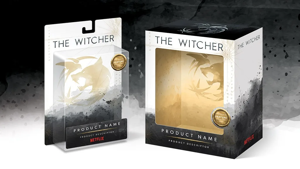
When the Netflix team approached my design consultancy, Design Force, to refresh the licensed product packaging program for The Witcher, their strategy was to appeal to The Witcher’s current fanbase, as well as to the broader fantasy and gamer audience, with a wide array of targeted merchandise geared toward fans and collectors. The goal for the packaging refresh was to create a look that was all-encompassing of the franchise, rather than one that focuses on a particular story arc or on the series’ upcoming third season. They wanted to adopt a simpler, more sophisticated aesthetic, without incorporating imagery of the characters from the series.
Telling the Brand Story
Our solution for the packaging refresh begins telling the story of The Witcher with a stark, white background, which is violated by a black, gritty watercolor texture. The texture is symbolic of the wilderness depicted throughout the series, with hints of the mountains and trees found within its landscape. Overlaying the textured background are subtle, gold cartographic details and runes pulled from the iconic map of the medieval-inspired landmass known as The Continent, where the series takes place. The White Wolf symbol, representative of Geralt of Rivia, dominates the remainder of the design refresh. It is used both as a soft, golden, atmospheric element that falls behind product, and as a branding device, rendered in steel blue metal on the top panel.
The storytelling continues with the packaging refresh’s gold accent color. The gold color of some of the package design assets — the cartographic details, the runes, the call-out burst, and the metal bar that separates the product name from the descriptor text — is inspired by Geralt’s eyes, which are a gold color as a result of the mutations he had to undergo to become a full-fledged witcher.
Getting the Story Straight for All Licensees
The refreshed packaging program for The Witcher is expected to hit retail shelves this month, just in time for the summer release of Season 3. Once the new look was approved, the use of all of its modular package design assets was standardized for the implementation of key packaging formats, including a blister card, header card, window box, closed box, and hang tag. Standardization ensures that every licensee tells the brand story consistently throughout the retail environment, regardless of the consumer product category.
Remember: Package design is arguably the most powerful tool for licensed brands to use to tell their story and capture the attention of their target audience. By leveraging visual assets closely associated with the licensed brand, package design can create an emotional connection for the consumer, leading to increased engagement and loyalty. Therefore, it is crucial for licensed brands to invest in compelling and memorable package design that not only communicates the brand’s story, but also stands out in a crowded marketplace.
A version of this article was originally published in the 2023 Licensing & Entertainment Issue of The Toy Book. Click here to read the full issue! Want to receive The Toy Book in print? Click here for subscription options!