
Why Consistent Package Design Appeals Most to Consumers
by TED MININNI, President and Creative Director, Design Force
Although this may be tough to hear, more often than not, the biggest reason why many toy brands’ package design systems no longer resonate with their target audiences is the fact that too many exceptions to the standardization guidelines have been made by the brand’s marketers and brand managers. In an effort to make new products that have been added to the line stand out among the company’s existing products, they often deviate from the usual guidelines and create something else that they feel looks fresh and different. They believe that, in doing so, the new products will more likely capture the attention of potential consumers.
However, rather than achieving the desired effect, continuously deviating from the package design system’s standardization guidelines leads to a disjointed brand statement at retail due to too many one-off package designs within the product line. Instead of evoking curiosity, these inconsistent package designs cause confusion among consumers. When consumers are confused, they lose trust in the brand and move on.
The fact is — all aspects of the package design system must be consistent for it to function properly at retail.
PACKAGE DESIGN EVALUATION
Prior to refreshing a brand’s packaging, we always conduct an evaluation of its current package design system to uncover any issues with how it has been maintained and standardized. In almost every case, our evaluation reveals inconsistencies in a variety of aspects of its design, whether they’re variations in the scale and placement of the brand identity, product-specific enhancements made to the package design architecture, dramatic shifts in the treatment of product imagery, or even a difference in the tone, style, and placement of marketing communication from one product’s packaging to another. These inconsistencies are extremely evident when viewing the brand’s packaging for a variety of SKUs within a single shelf set, as well as when comparing the brand’s packaging to that of competitive brands.
Our evaluations have also found that many of these inconsistencies are a result of marketers and brand managers adopting a product-centric rather than brand-centric approach when it comes to their packaging. Taking liberties with package design assets and their standardization on a product-by-product basis suggests that compromises can be made wherever and whenever necessary. The fact is — all aspects of the package design system must be consistent for it to function properly at retail. Arbitrary or whimsical decisions made on a case-by-case basis are extremely detrimental to the product line’s shoppability.
THE POWER OF VISUAL CONSISTENCY IN DESIGN
What truly needs to be understood by brand owners is this: When refreshing a brand’s package design system, rules need to be established for the usage of brand-specific package design assets and product-specific package design assets. Making this distinction is incredibly powerful. When the overarching, brand-specific package design assets are treated in a consistent manner across the entire product line, consumers will immediately notice the aspects of the packaging that do change from one product to another. These differences — all of which should be product-specific — are more noticeable due to their contrast with the elements that remain common. By taking this approach, the resulting visual cohesiveness will build equity in the minds of consumers, and recognition of the brand will improve across all retail channels.
TOY BRANDS BENEFIT FROM CONSISTENT PACKAGE DESIGN
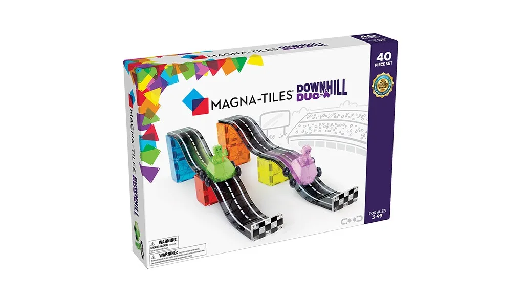
Magna-Tiles, the magnetic construction system with geometric plastic tile pieces, has a simple, yet elegant package design system. The packaging is primarily white, with the main build photographed on a white surface filling the center. The Magna-Tiles logo is centered above the product photo and the design architecture in the upper left corner of every set is a colorful series of overlapping tiles. Along the right side of the front panel is a solid-colored, vertical bar that displays piece count, recommended ages, and a Most Trusted Brand Award for Educational Excellence seal. This vertical bar is utilized as a color-coded product segmentation system. On all Classic set packaging, the vertical bar is a royal blue. For themed sets, the bar’s color changes and a matching phrase appears next to the company logo. For animal-themed sets, the product segmentation system is further enhanced by a pattern of tonal footprints contained within the bar.
The simplicity and visual consistency of Magna-Tiles’ package design system allow consumers to intuitively identify how the product line is segmented within a matter of seconds. Consumers can locate piece count and product theme immediately, due to their consistent placement and treatment, which makes this line a pleasure to navigate at retail. Only a handful of specialty items, such as a glow-in-the-dark set, a clear tile set, and a storage bin, veer slightly from this standardization due to the need for additional product feature clarity.
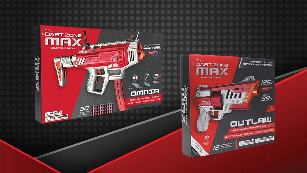
The Dart Zone Max line of foam dart blasters from Prime Time Toys is another great example of a package design system that benefits from visual consistency. Not only does this product line’s packaging make a strong, impactful brand statement on the shelf, it does an incredible job of delivering quite a bit of pertinent information about each product in a very concise and cohesive manner. The upscale, technical appeal of this package design system gives this product line a high perceived value. However, it’s the clean, clear organization of information that makes the line easily shoppable. The brand name is at the top while the product name is placed along the bottom of the box in white above a red horizontal bar. The overall background is a solid red with a dark gray pattern that gives the packaging a sense of energy and movement. Surrounding the product imagery are different call-outs that let consumers know the type of darts each blaster uses, the maximum distance it shoots, and in some cases, the speed at which the darts are fired. Each package also includes its piece count as well as a list of all the included parts and accessories. With these aspects remaining visually consistent from product to product, the stylistic differences between each blaster are immediately evident at a quick glance. Consumers can very easily compare one product to another while also clearly and quickly understanding their respective features and different performance capabilities.
HOW TO ADOPT THIS METHODOLOGY
Once your brand’s packaging has been designed and standardization guidelines have been created, avoid deviating from the guidelines. Instead, highlight each particular product’s unique attributes in a clear and concise manner within the areas designated for product-specific communication. And, leverage the devices made available by the package design system to tell a compelling story about the product. Doing so will inherently make the product appear unique among others in the line.
By changing the collective mindset among your marketers and brand managers to this approach, your brand’s package design system will remain visually intact, and shopping the product line will be a positive, enjoyable brand experience for its target audience.
A version of this feature was originally published in the 2023 Toy Fair issue of The Toy Book. Click here to read the full issue! Want to receive The Toy Book in print? Click here for subscription options!